Before vs After: How I Redesigned My Website
Have you ever opened your own website and felt that something was missing?
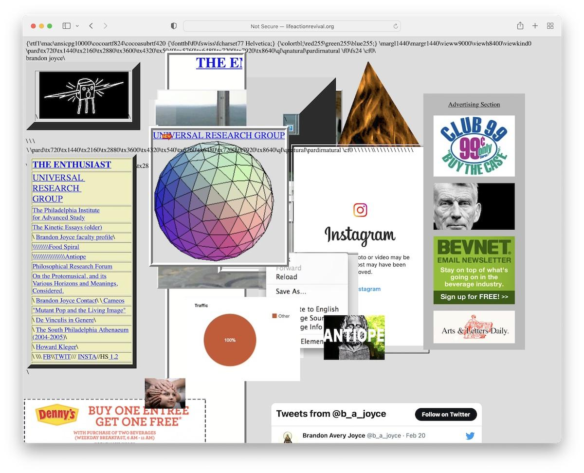
The website works, the pages load, and the content is there. But somehow, it doesn't look as good as you imagined.
That is exactly why website design matters.
A website is often the first thing people notice about a project or business. A clean and attractive design can make visitors feel comfortable, while a confusing layout may encourage them to leave.
In this article, I want to share what a website redesign can change, what I learned from the process, and why even small improvements can make a big difference.
- Before the Redesign: What Was Missing?
When building a website, beginners usually focus on making everything work first. They think about HTML, CSS, JavaScript, buttons, links, and functionality.
That's important, but functionality alone doesn't make a website user-friendly.
A website can have working features and still look unfinished.
Some common design problems include:
- Too many colors without a clear theme.
- Text that is difficult to read.
- Poor spacing between sections.
- Buttons that don't stand out.
- Images that don't match the layout.
- A design that looks different on mobile and desktop.
- Navigation that makes it difficult to find information.
These small problems can affect the overall experience.
For example, imagine visiting a website where the heading is difficult to read, the buttons are hidden, and everything is too close together. Even if the website has useful content, you may not enjoy using it.
- The Redesign: Making Things Better
A redesign doesn't always mean changing everything.
Sometimes, the best approach is to keep the useful parts and improve the areas that need attention.
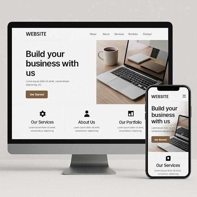
Here are some changes worth focusing on.
- Choosing better colors
Colors create the overall feeling of a website. Instead of using many random colors, choose two or three main colors and use them consistently.
- Improving typography
Text should be easy to read. Clear headings, suitable font sizes, and proper line spacing make content easier to understand.
- Fixing spacing and alignment
Good spacing makes a website feel organized. Sections should have enough breathing room, and elements should be properly aligned.
- Improving buttons and navigation
Important buttons should be easy to notice. Navigation should also be simple so visitors can find the information they need without confusion.
- Making the website responsive
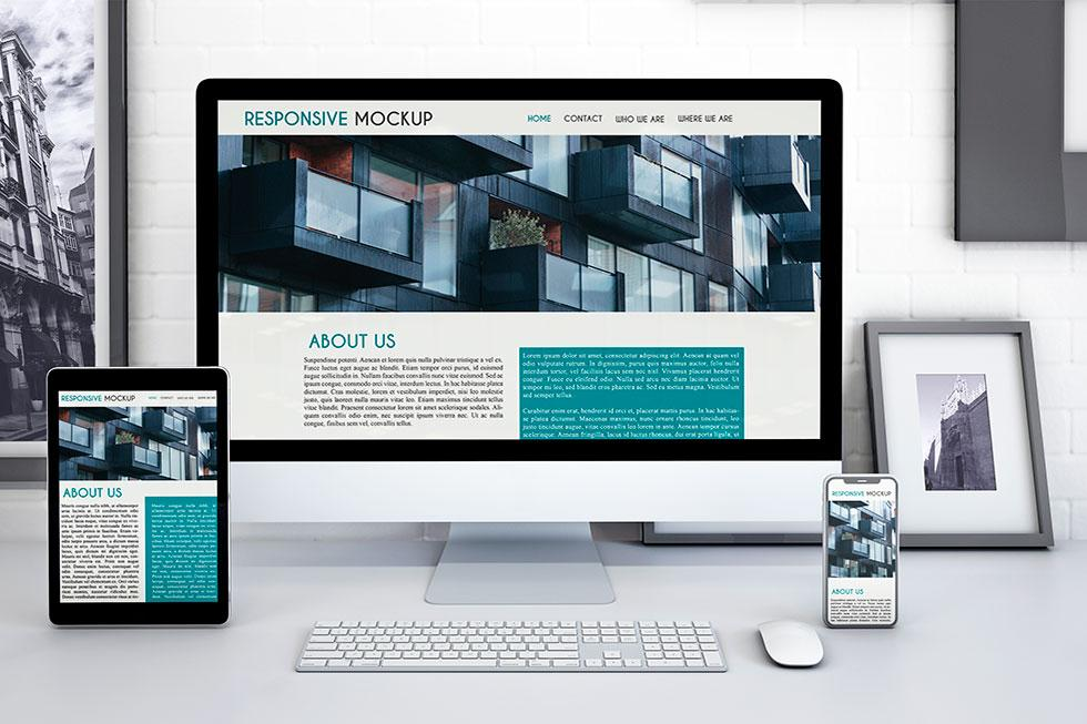
A website should work properly on mobile phones, tablets, and desktops. A design that looks great on a laptop but breaks on a phone is not a complete design.
- Before vs After: What Changes?
The difference between an old design and a redesigned version can be surprising.
Before After
Random colors Consistent color palette
Crowded layout Clean spacing
Small or unclear text Readable typography
Confusing navigation Simple navigation
Basic buttons Clear call-to-action buttons
Poor mobile layout Responsive design
The goal isn't simply to make a website look modern. The real goal is to make it easier for people to use.
A beautiful website is useful, but a beautiful and easy-to-use website is even better.
- What I Learned From Website Redesign
One important lesson is that design is not just about appearance.
When improving a website, I learned to think about the visitor instead of only thinking about how the page looks.
For example:
- Can someone understand the purpose of the website quickly?
- Can they find the important information easily?
- Are the buttons easy to identify?
- Does the website work properly on a mobile screen?
- Is the content comfortable to read?
These questions help us make better design decisions.
I also realized that small changes can improve the overall appearance. We don't always need complicated animations or expensive design tools.
Sometimes, better spacing, a suitable font, and a consistent color scheme are enough to make a noticeable difference.
- Tools That Can Help
You don't need to be a professional designer to improve a website.
Some beginner-friendly tools include:
- HTML and CSS: For creating and styling website layouts.
- JavaScript: For interactive features.
- Figma: For planning and designing website interfaces.
- Google Fonts: For choosing readable fonts.
- Chrome DevTools: For testing layouts and fixing responsive design issues.
The best way to improve is to experiment, compare different designs, and keep practicing.
- Final Thoughts
Redesigning a website is a good reminder that development doesn't end when the code starts working.
A website should be functional, attractive, responsive, and easy to understand.
If you're a beginner, don't worry if your first design doesn't look professional. Every developer starts somewhere. Build something, review it, identify what can be improved, and try again.
Sometimes, the difference between a basic website and a good website is simply the willingness to improve it.
Your first design doesn't have to be perfect. Your next version just needs to be better.
MUST VISIT:
https://bit.ly/4rgikWP