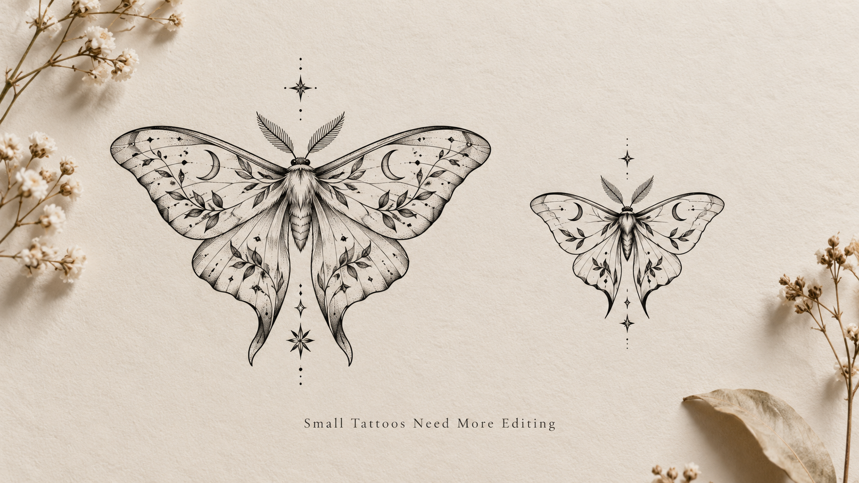
Why Small Tattoos Often Need More Editing Than Large Ones
People often assume that a small tattoo is simply a smaller version of a large tattoo.
In practice, making a tattoo smaller usually creates more decisions, not fewer.
You lose space.
You lose separation between lines.
You lose room for text, texture, shading, and secondary details.
And once the available space shrinks, every part of the design has to work harder.
That is why small tattoos often need more editing than large ones.
Scaling down is not the same as simplifying
Take a design that works well at eight inches and reduce it to three.
The subject may still fit inside the same rectangle.
But that does not mean the tattoo still works.
Small details that were easy to read before may begin to merge.
Text may feel crowded.
A decorative background may compete with the main subject.
Thin gaps may disappear.
The design technically fits, but the information density is now much higher.
That is why I think of small tattoo planning as an editing problem rather than just a sizing problem.
The smallest details usually fail first
When a design gets smaller, the first things to question are usually the details that do not carry the identity of the tattoo.
That might include:
- tiny texture
- repeated decorative marks
- small background symbols
- fine fur or feather lines
- subtle shading transitions
- narrow gaps between shapes
- ornamental filler
These details can make a large digital design feel rich.
At a smaller tattoo size, they may simply make the design harder to read.
A useful question is:
If I remove this detail, does the tattoo lose meaning or just lose decoration?
If the meaning survives, that detail may be flexible.
Negative space becomes more important
Small tattoos need room to breathe.
That is easy to underestimate when looking at a large image on a screen.
At a larger size, two lines can sit fairly close together and still look separate.
Reduce the design enough and those same lines begin to feel like one dark shape.
The same thing happens with:
- letters
- feathers
- scales
- flower petals
- facial features
- ornamental borders
Leaving more negative space can make a small tattoo look simpler than the original design, but it often makes the important shapes much easier to understand.
Lettering gets difficult very quickly
Names, dates, initials, quotes, and Roman numerals can become challenging at small sizes.
The issue is not only whether the letters technically fit.
It is whether they remain clear.
For lettering, I would check:
- spacing between characters
- thickness of strokes
- whether script loops touch
- whether ornaments cross the text
- whether repeated Roman numeral strokes become crowded
A name tattoo that looks elegant on a large preview may need simpler lettering once the intended size is considered.
This is one reason I would choose the size before becoming too attached to a specific font treatment.
Placement can make a small tattoo harder or easier
“Small” does not mean the same thing on every part of the body.
A narrow wrist has different constraints from an upper arm.
A vertical forearm placement may give a design more usable length.
A shoulder may support a wider composition.
A finger may dramatically limit spacing and detail.
So before simplifying the artwork, I would ask:
What shape does this placement naturally support?
A design may not need fewer ideas.
It may need a different layout.
Keep the identity before keeping the detail
When a small design needs editing, I try to identify the one part that must remain recognizable.
That could be:
- the silhouette
- an animal's expression
- an exact date
- a handwritten word
- one important symbol
- a distinctive shape
- a particular pose
Once that is clear, everything else can be evaluated around it.
I like the rule:
Keep the identity. Edit the explanation.
A wolf tattoo does not necessarily need every strand of fur.
A flower does not need every vein in every petal.
A Roman numeral date does not need elaborate framing if the framing makes the numerals too small.
A small tattoo is often stronger when the main idea is allowed to dominate.
A quick test before making a tattoo smaller
Before reducing a design, I would check four things:
1. What must stay recognizable?
Identify the part that carries the meaning.
2. What can disappear?
Look for texture, filler, secondary symbols, and background elements that are not essential.
3. Does any text still work?
View lettering close to the intended size rather than zooming in.
4. Does the placement support the shape?
Do not assume the same composition works equally well on the wrist, forearm, shoulder, ribs, or ankle.
If those four questions are answered first, simplifying the design becomes much easier.
Small tattoos are not necessarily simpler tattoos
A large tattoo gives a design room.
A small tattoo forces prioritization.
That does not make small tattoos worse.
It just means they benefit from more editing.
The design may need:
- fewer secondary elements
- stronger shapes
- clearer spacing
- simpler lettering
- less texture
- a more placement-specific composition
If you are trying to work out whether an idea has too much detail for the size you want, I use a more structured tattooability checklist to check size, readability, placement, and simplification.
The goal is not to remove everything interesting.
It is to make sure the important part still survives when the tattoo becomes smaller.